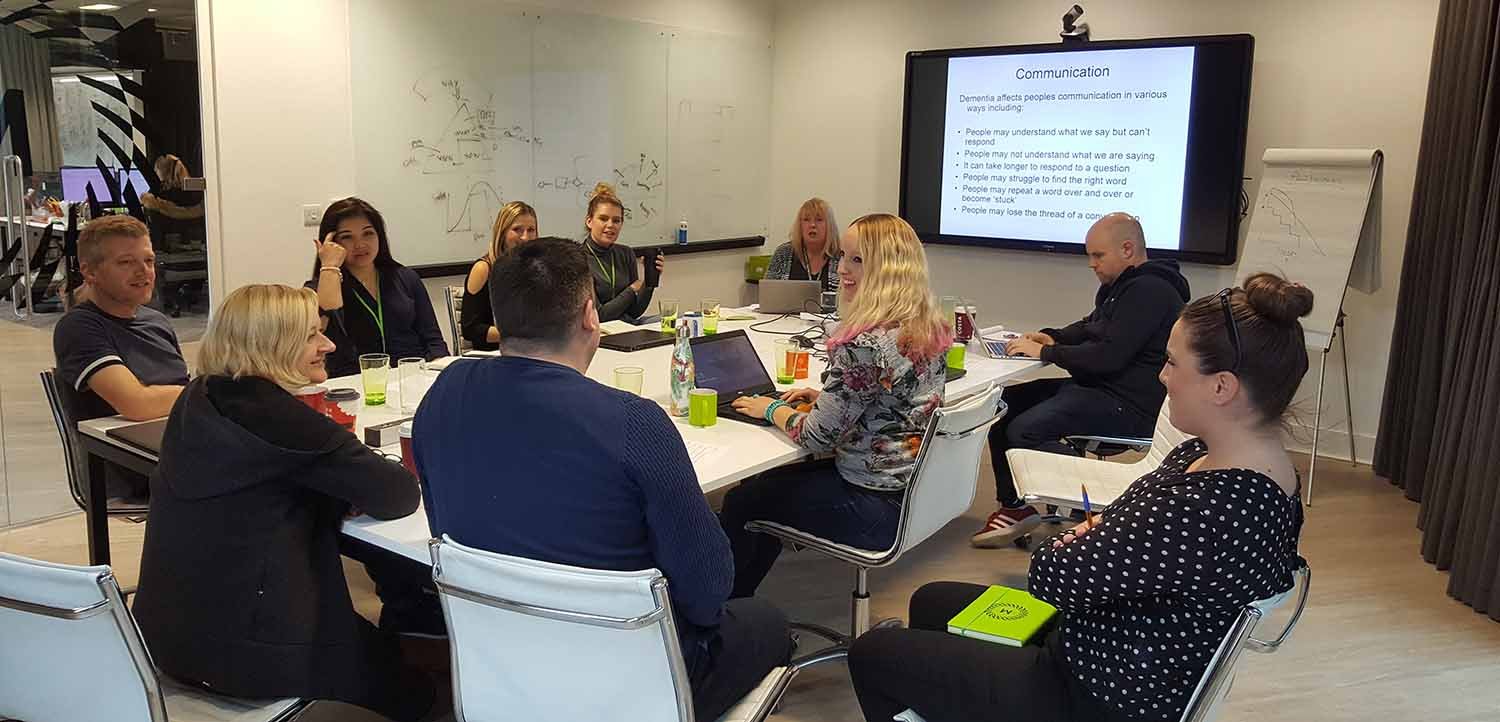
Alzheimer's Society came in to deliver training on dementia; to help us understand more about the symptoms people experience so we can design digital solutions that better meet their needs.
The need for an accessible customer experience is of growing importance: there’s almost 1 million people living with dementia in the UK and it’s expected to affect over 2 million people in by 2050.
There are various types of dementia, and so the symptoms and effects vary, but it can typically cause issues with:
- Confusion
- Perception and vision
- Problem solving and thinking speed
- Judgment
- Processing and sequencing information
- Language and words
With dementia being most common in over 65s, the symptoms can often be coupled with other impairments associated with old age.
It might not be possible to create something that works for everyone, but there are small things we can think about when designing digital solutions that will increase the odds of us getting things right.
Here’s a few things to consider.
Colour and contrast
- Use of colour: Colour shouldn’t be used as the only visual means of conveying information, indicating an action, prompting a response, or distinguishing a visual element. Avoid the use of blue, especially for important interface components.
- Contrast: The colours between text and background should have a contrast ratio of at least 4:5:1.
- Non-text contrast: Do the colours used in interface components (i.e. Controls) and any meaningful graphics (icons, infographics, graphs, pie charts etc.) have sufficient contrast with the adjacent surroundings? It should at least be a 3:1 ratio.
Simple navigation and clear signposting
- Labels and instructions: Are form field labels visible, meaningful and in close proximity to the associated field? Only using a placeholder as a label would fail.
- Link purpose: Is every button or link purpose clear? Read more and click here would fail.
- Headings and labels: Does the design use clear and consistent headings/labels? Do the headings and labels make sense out of context so users can predict what each section contains?
- Meaningful sequence: Does the design interface have a logical consistent structure and content hierarchy?
- Multiple ways: Does the design offer several ways to find pages (e.g. navigation, search, sitemap)?
- Imagery and text: Use a combination of text, imagery/iconography when signposting (people with dementia may struggle with language, like remembering a word or terminology).
Wording and font
- Language: Avoid using abbreviations, acronyms, complex wordplay and jargon. Use clear, specific and explicit language.
- Font: Use sans-serif fonts - the letter shapes are generally more readable on digital screens. Avoid using multiple fonts, unnecessarily. This can make the interface and content confusing.

New and emerging channels…
Voice is fast emerging as the channel of choice for many; research by YouGov last year found that one in ten Brits owns a smart speaker, which works out to about 6.6 million people. That’s up from one in twenty the previous autumn.
The same research revealed that older people are more likely to have a smart speaker. A third of owners (33%) are aged 55 and over, while 23% are in the 45-54 age group, and 10% are aged 18-24.
Devices like Amazon Echo and Google Home have already been touted for their potential to help those with dementia.
They’re hands-free; there’s no typing or touch involved so they can be used however the person’s dexterity is. They can be used to set alarms; to remind people to take their medication for example. And they don’t get frustrated; someone with dementia may need to ask the same question repeatedly, like ‘What is today’s date?’ The person can ask these assistants any question and get an answer as many times as they like – and of course, machines don’t get frustrated.
As more and more businesses bring voice into their customer experience strategy, the potential of these devices to help people with dementia grows.
It’s not difficult to imagine how they might reduce friction for everyday tasks. Whether that’s being able to ask when the bins are due to be collected, or why there is an issue with your water supply (South Staffs Water has already launched such a skill on the Amazon Echo).
The topic of vulnerability as a whole is increasingly garnering the attention of businesses and regulators across sectors. An ageing population, at a time where businesses are increasingly shifting their services online, means there is growing pressure to design experiences that meet the needs of everyone.
If you would like to learn more about how Mando can help you to make digital simple for all of your customers, download our latest white paper, Making Digital Simple For Everyone.
If you want to talk to us about how we can help you, contact andy.deakin@mando.agency
Interested in talking to one of our consultants?
